- 2 types of visual conventions relational and individual
composition
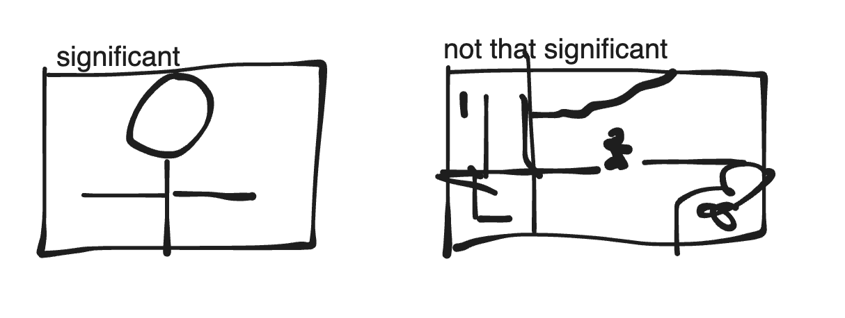
- the position of in foregorund, background, and rule of thirds.

- size and scale: relative size of elements, what takes majority of frame
- juxtaposition/proximity: elements place to another to invite comparison, or close/distance
practice
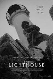
- the lighthouse poster

- relational elements:
- dutch tilt/canted angle : scary
- lighthouse is larger, though it is in the background.
- background invites that it is mysterious, as the small details is harder to see.
- foreground character is smaller relative to lighthouse and bottom
best response use consistent metalanguage; focus analysis on meaningful stuff

- teacher analysis analysis
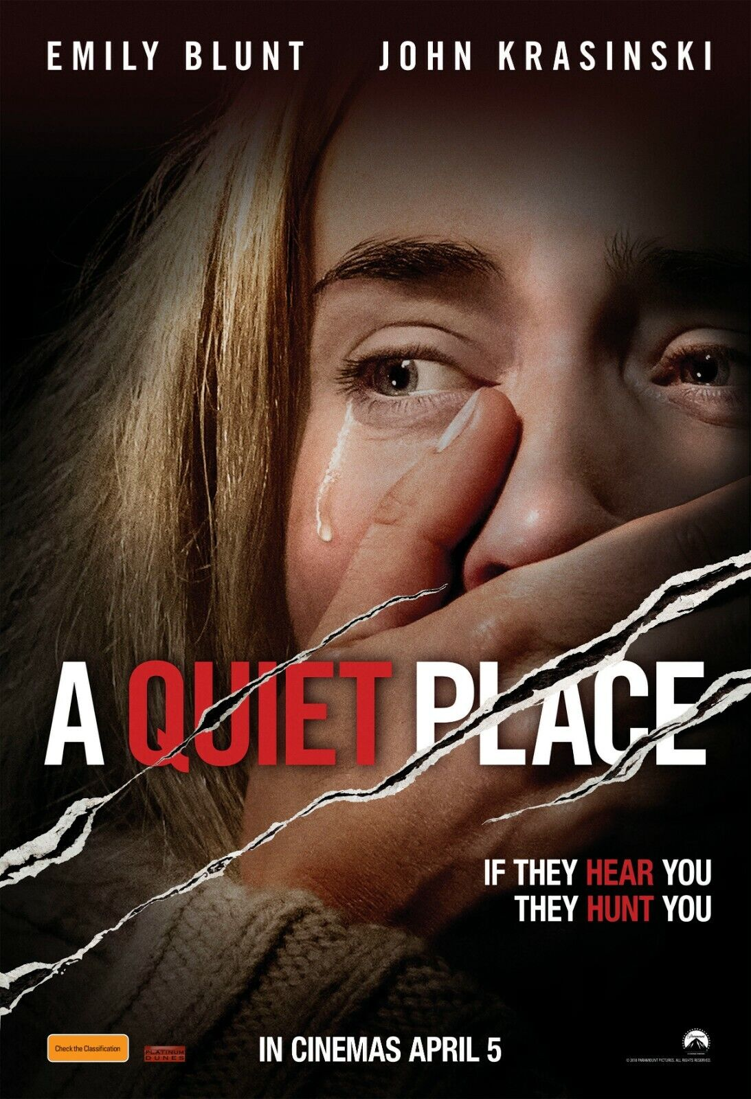
- close up shot -> facial expression -> gaze -> spotlight -> salience -> centre of the frame -> presence of immediate threat.
- pick out conventions: find important ones to answer the question.
- element suggests/implies/symbolises/connotes
- element captures/displays
- element positions viewers to see…
- element illuminates/highlights
- element draw’s viewers’ attention to
- element emphasises/gives salience to
- effect is reinforced/amplified/magnified